Gildan
Year
March 2019
Team
- UX Designer (me)
- Visual Designer
- Project Manager
- Strategist
- Developers
My Role
- Defining Users
- Information Architecture
- User Flows
- Wireframes
- Prototyping
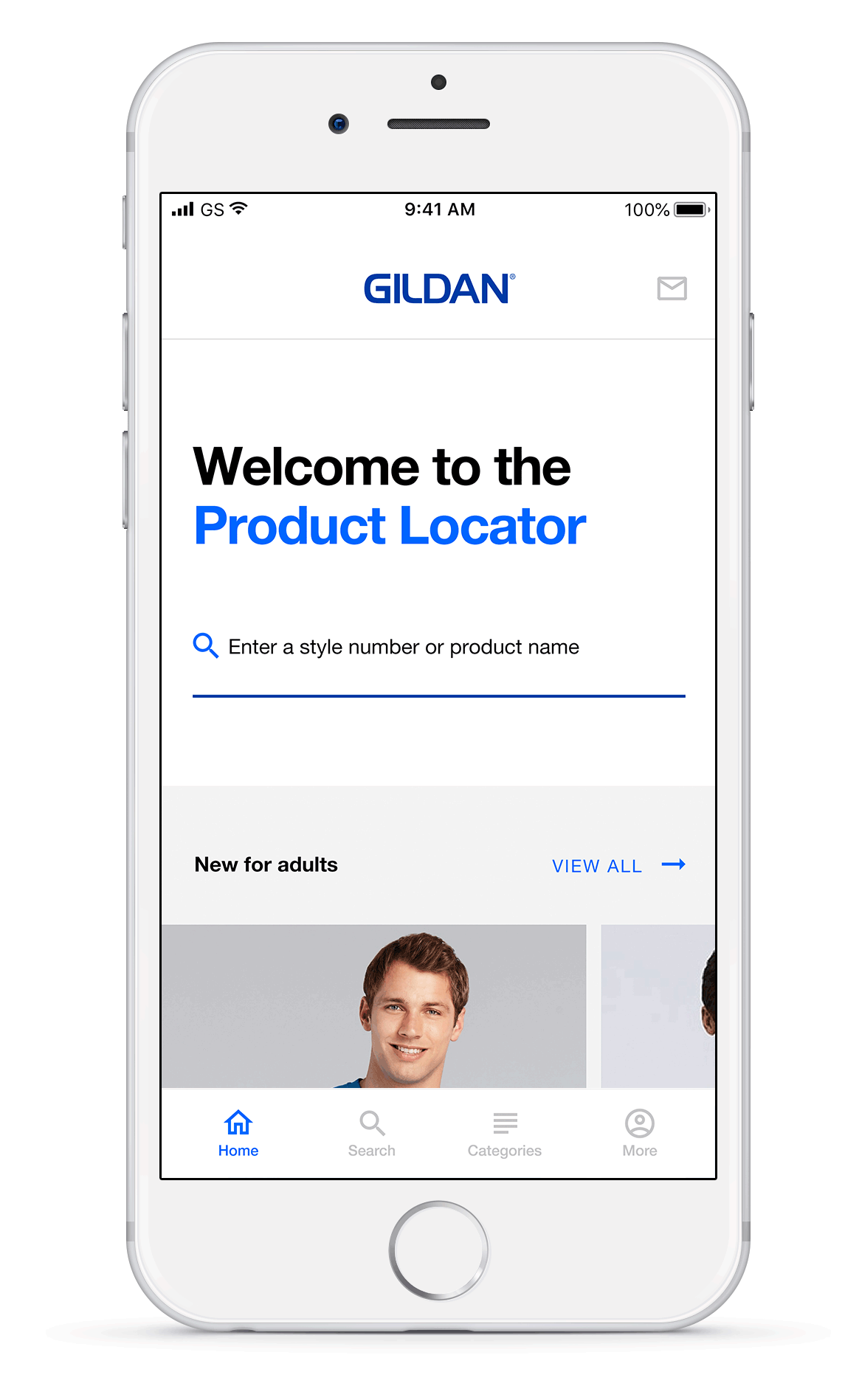
Creating a mobile first B2B platform to help retailers find and source products from distributors easily.
Gildan is a manufacturer of branded clothing. It is a 2 billion dollar company and owns American Apparel, Comfort Colors and Anvil. The company produces undecorated blank activewear such as t-shirts, sport shirts and fleeces among other apparel, which are subsequently decorated by companies with designs and logos or sold to retail companies. The ask was to create a best of breed tool and destination to connect Gildan with distributors by giving them clear access to products so that they could find and source products from Gildan easily. The app was meant for the North American market.
Although the Product Locator app is B2B at the moment, it had to be scalable to allow Gildan to add e-commerce capabilities and go B2C in the next few phases.
Defining our users
The Product Locator app had 2 personas.
Mark was the primary persona whereas Keren was the secondary persona.

PRIMARY PERSONA
Mark Gonzalez, 52
Small Business Owner
Mark has been in the business for 15 years. He provides his services the old fashioned way – face to face with a smile and some good advice. He isn’t overly interested in new fashion trends but does make it a point to attend trade shows, go through catalogs and check manufacturer websites.
Needs
Search and find inventory quickly and easily.
Easily source products from distributors.
Increase sales by learning bestsellers and trending products.
MARK – SCENARIO 1
Mark has a large order from a sports team. He has to deliver several round neck blue t-shirts to them in time. Mark knows which t-shirt he wants to buy. But he would like to know more about the fabric details before he makes his decision.
Mark wants to learn the details of the product before making a decision.
MARK – SCENARIO 2
Mark has a large order from a sports team. He has to deliver several round neck blue t-shirts to them in time. Mark knows exactly which t-shirt he wants. He simply wants to check if they are in stock or not.
Mark has made his decision and only wants to know the stock levels.

SECONDARY PERSONA
Keren Baraja, 31
Manager at DIY Print Studio
Keren is the manager of an artist run silkscreen production studio that specialises in hand-printed fine art. She likes experimenting with new styles and textures. She is always looking for ways to optimise, increase efficiencies and save time and money on products.
Needs
Explore and browse comfortably and conveniently.
Printing information for each product.
Learn what's on sale to get a good deal.
KEREN – SCENARIO 1
Keren has a printing job and is looking for t-shirts on which her design would look good.
In this scenario, Keren is an explorer and wants to browse for the right t-shirt.
Sitemap.
Based on Mark's and Keren's needs and scenarios, I organised the pages of the app in a sitemap.

User Flow.
Based on Mark's and Keren's scenarios and the sitemap I created, I defined their flows through the app to satisfy their needs.

Wireframes.
Once I had the pages of the app and the flow of the users through the app defined, I worked on the individual pages.

WHAT DO THESE PAGES DO?
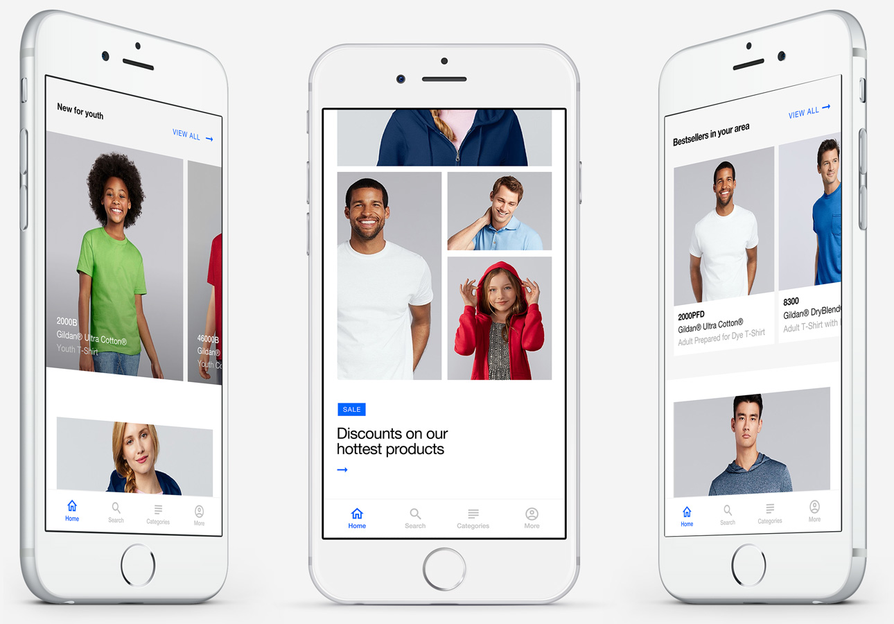
The Home Page.
The Home page allows Gildan to strategically promote their products/sales and inform Mark on the trending styles.
Learn what's new, on sale and what the trendy new styles are.
The home page is a place for Gildan to introduce their new products, promote sales, bestsellers and inform Mark on what the popular styles and collections are.
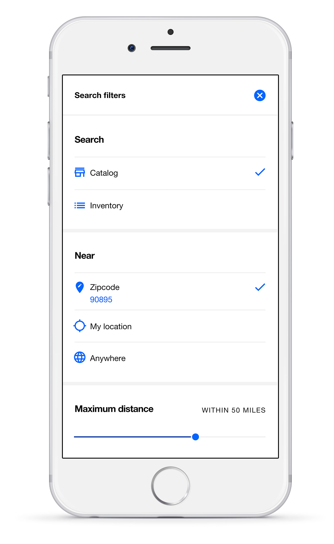
The Search Page.
A Search page to find the exact product you are looking for.
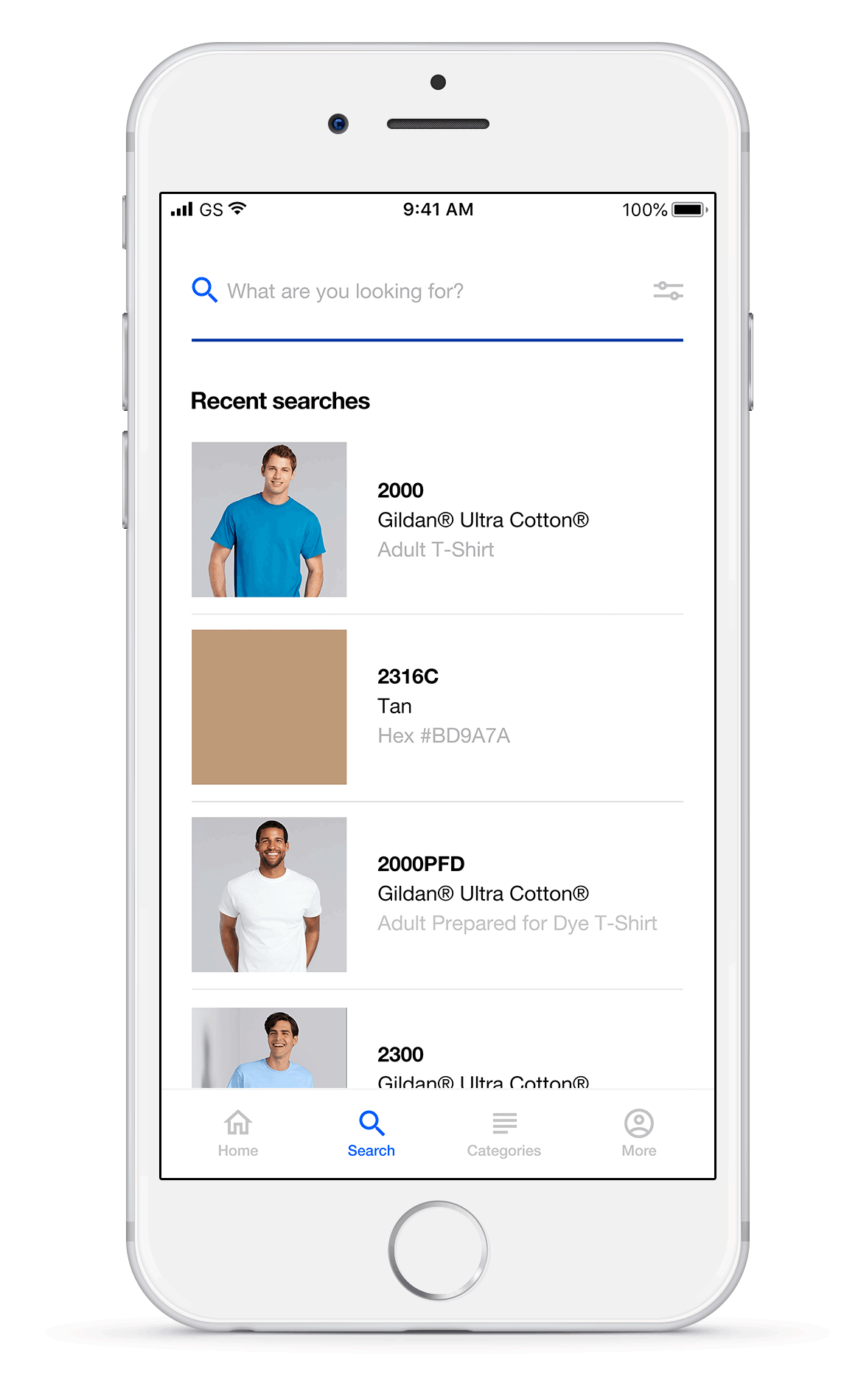
Quickly search for products or pantone colours.
The search page allows Mark to quickly type in his product or preferred pantone color and find what he is looking for instead of going through layers of tabs and menus to find his desired product or color. Showing recent searches for repeat users of the app lets them easily access their searches and find what they were looking for quickly.
Quickly search for product details or inventory.
The search filters allow Mark to either search the Gildan catalog for product details (PDP) or search the product inventory with the selected distributors. Using the Catalog filter allows Mark to find the PDP (scenario 1) whereas using the Inventory mode allows Mark to skip looking at product details and directly get an idea of the stock levels with the distributors (scenario 2).
The Product Listing Page.
The Listing page shows a list of offerings allowing Keren to browse and explore the entire Gildan range.

Customize your view to your preferences.
Keren can view the Gildan offerings by grids or by lists – whatever she finds convenient. Filters allow her to narrow down her range and focus her browsing experience if she chooses to.
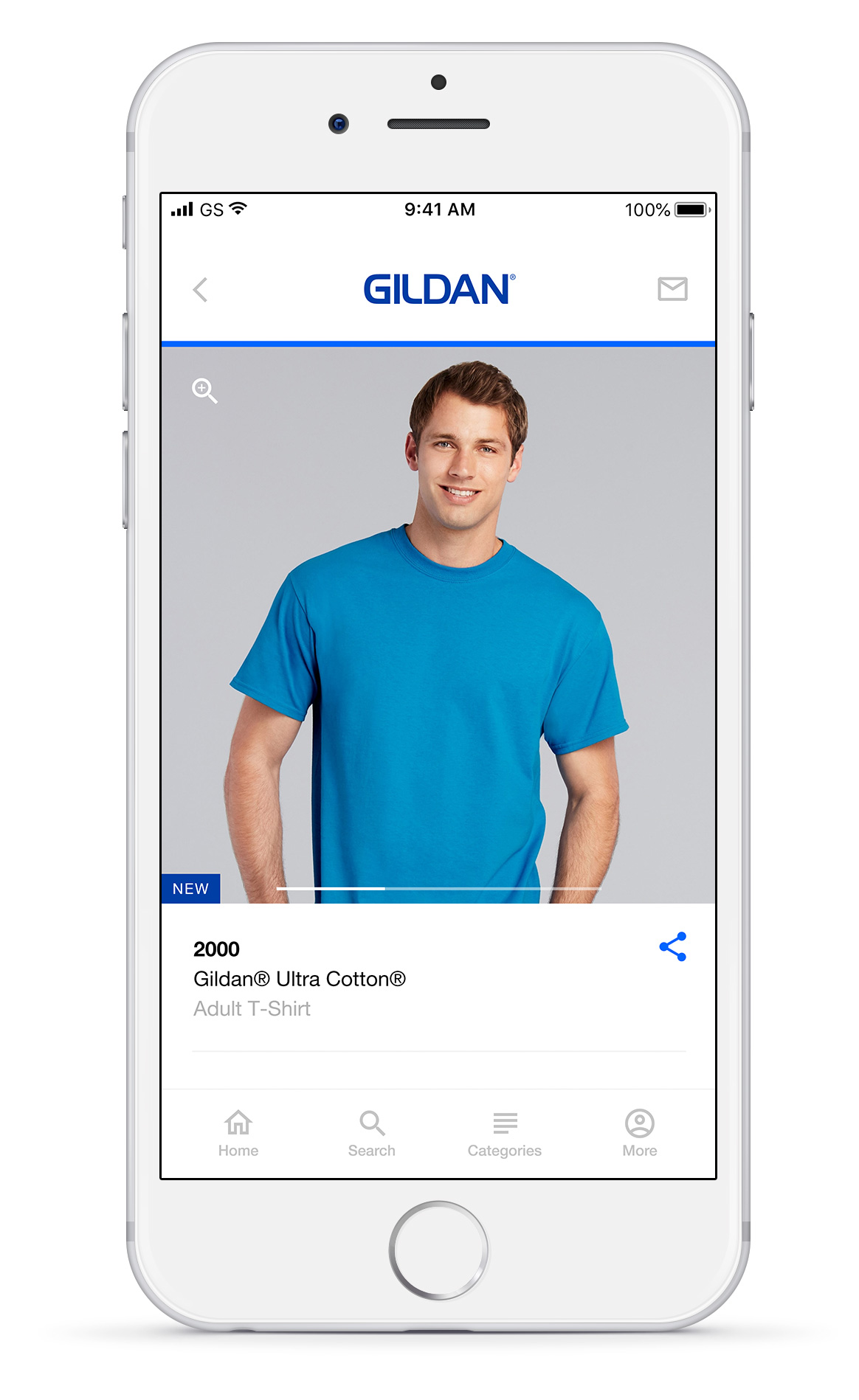
The Product Detail Page.
Find colours, sizes, stock levels, fabric details and printing recommendations.
On the product details page, Mark can preview the product with different colours and from different angles. Since retailers buy products in larger stocks and different styles, the app allows him to select up to 5 different colours. Keren can also learn more about the appropriate printing techniques for the fabric.
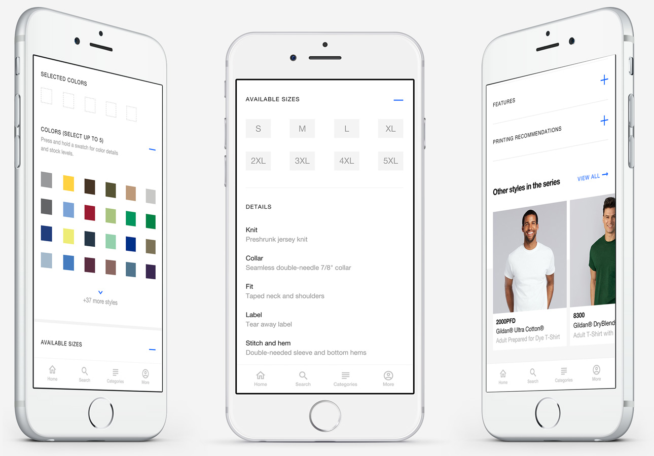

Colour info and stock levels for 61 colours and 8 corresponding sizes.
How do you show stock levels for 61 colours and 8 corresponding sizes? To not make the screen overwhelming for the user, I decided to hide the information in a panel which could be brought up by tapping and holding a colour swatch. Even though this interaction is hidden, the information to bring up the interaction is clearly visible. The line below ‘Colors’ states ‘Press and hold a swatch for colour information and stock levels’. This would ensure that the interaction would be understandable.
Selecting and previewing multiple colours.
Users need a way to preview images of the 5 selected colours at the top without having to scroll through 61 colours. And if tapping a colour a second time would deselect it, the question was, how would a user preview the image? Which is why we made a section at the top with Selected Colors and 5 empty swatches. The users could select the colours which would load up the swatches and then preview them easily while also having an easy way to delete any of the colours.

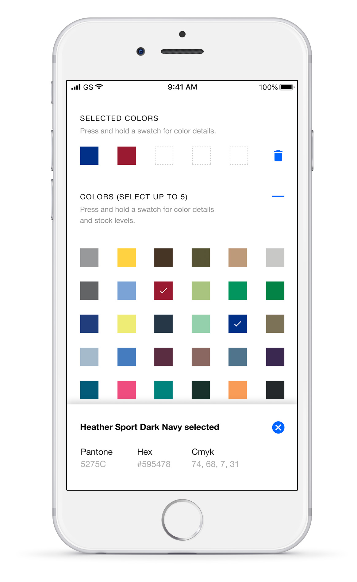
Avoiding mistaken selections.
Whenever a user selects a colour, they would also get a confirmation message indicating the colour name, pantone colours and the hex code. Like previously mentioned, the user can also press and hold a colour swatch to check the colour information.
Actionable error messages on selecting more than the 5 maximum colours.
Error messages don’t just inform Mark that he is trying to select more than 5 colours. Instead, they also give him a chance to remove a colour and replace it with the last selected colour instead of him having to manually scroll to the top to remove a colour.

The Distributors Page.
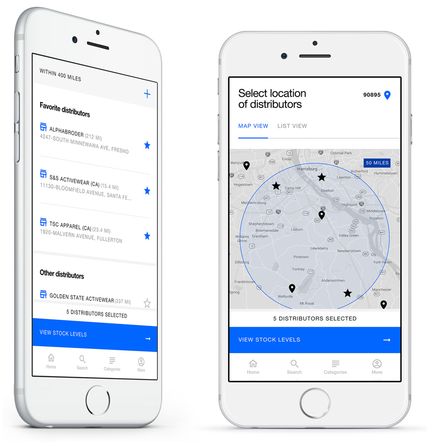
Allows Mark to choose the maximum distance he is willing to drive to get to his distributors.
On this page, Mark can adjust the maximum distance he is willing to drive to find a distributor and to narrow down the number of distributors. He can use the map or the list view to see the available distributors in his area. In the list view, distributors are sorted by favourites rather than by distance because retailers have already built relationships with their distributors and prefer doing business with the same ones rather than someone they don’t know.
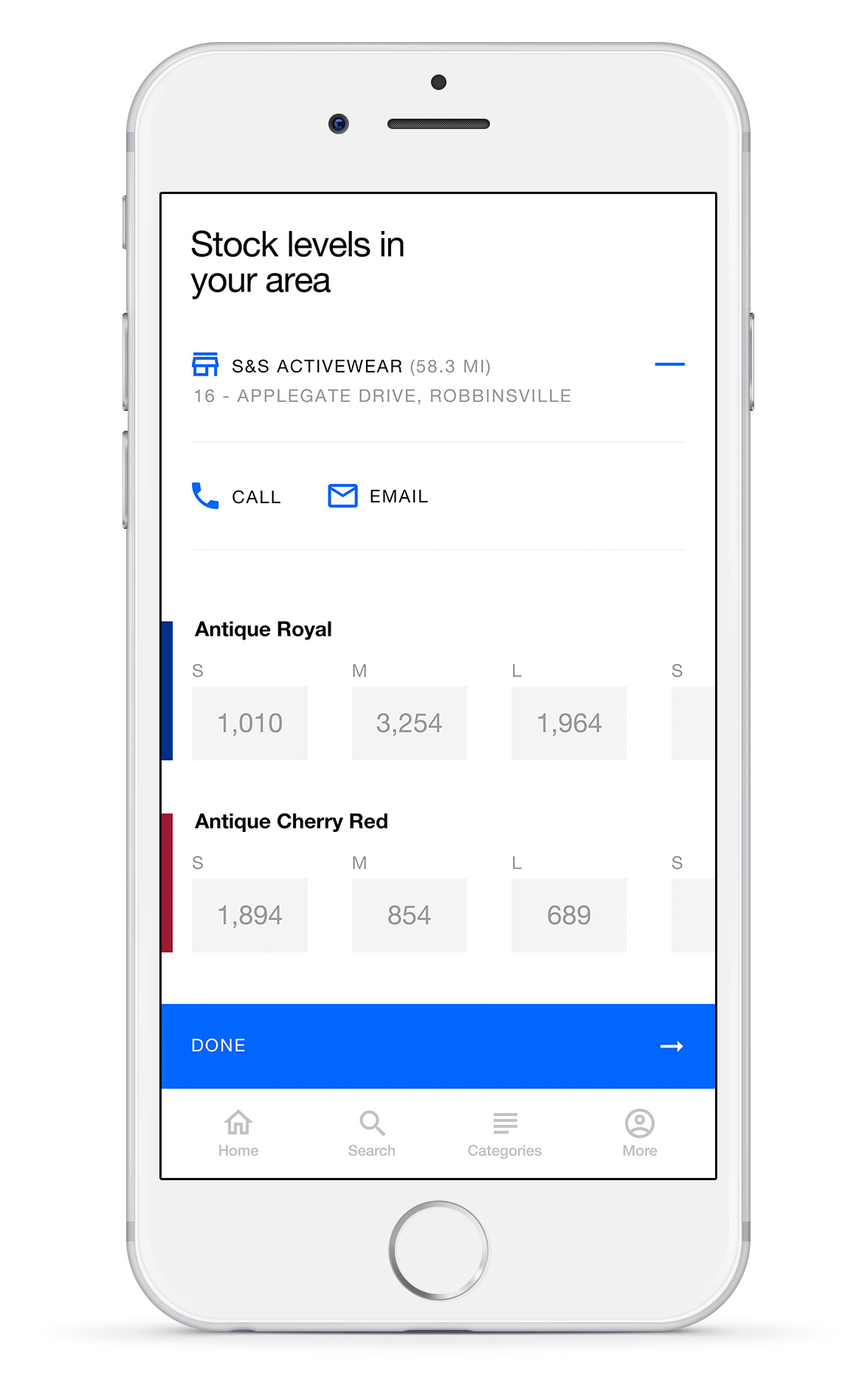
The Stock Levels Page.
View stock levels for desired sizes and colours at the selected distributors.
Mark can look at the available stocks for a specific colour and size at multiple distributors. Although he can’t order products now, this page would be used to enable Mark to select his order quantities in the future.